Nothing Phone (1) Mini gets futuristic design
Nothing Phone (1)
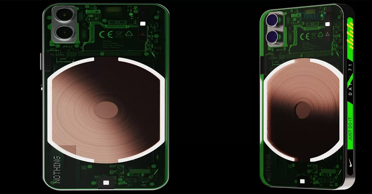
Nothing Phone (1):Carl Pei led UK-based technology firm introduced a new smartphone design in 2022 with the Nothing Phone (1). The Nothing Phone (1) had everybody’s attention when it was launched and it received a great response from the buyers. Although there were mixed reactions about the Glyph Interface of the Nothing Phone (1), it went on to become the ‘most-selling’ smartphone in its segment. As Nothing Phone (1) draws slight inspiration from Apple iPhone, an independent designer Priyanshu Jaiswal has followed that path and shared renders of what Nothing Phone (1) Mini may look like. The Nothing Phone (1) Mini concept shares design ques with the original Phone (1) but gets some radical features such as a screen at the left edge that fills with bubbles or fizz when the battery is charging. It also reveals the battery percentage.
On the right side, the Nothing Phone (1) Mini gets an Essential Tab that shows the Wi-Fi, time, Bluetooth and weather. Instead of volume rockers, the device gets a unique vertical scroll that will allow users to control the volume and also to easily scroll through social media platforms without swiping the fingers repeatedly. You can watch the video of the Nothing Phone (1) concept below.
Nothing introduced the transparent design language with Ear (1) TWS earbuds and similar design was used in the Phone (1). With Phone (1) Mini, the designer has enhanced the transparency and also added colour changing back light and sidebar that allow users to change the colour of the smartphone.

